


Online Portfolio Overview
Here you will find a sampling of the array of projects and results I have designed and completed.
Online Portfolio Overview
Here you will find a sampling of the array of projects and results I have designed and completed.


Digital Campaign
Digital Campaign


D I G I T A L C A M P A I G N - S H A K E I T U P
Cross channel digital campaign for an online competition.
Tieton Cider Works is an enviable anomaly in the cider industry - family owned for three generations, all their heirloom cider apples are estate grown. As Washington's largest craft cider grower and producer, they are poised to become a category leader across the US.
To increase brand awareness and customer-participation, they launched CiderShake - a contest for the best cocktail. Working across multiple channels, different yet unified messaging was used. The main website, Youtube, Instagram, and Facebook were utilized as well as partner sites for promotion and advertising.
The campaign ramped up well with many entries - this will now be the first of an annual competition.
Branded Marketing
Branded Marketing


B R A N D E D M A R K E T I N G - C R O S S C H A N N E L C O H E S I O N
Unified branded marketing materials for this software company in Maryland.
This analytics and software as a service big data company was looking to update their brand. They wanted fresh visuals and a clear message for maximum customer accessibility, and unity across channels.
Working with a web design firm, I wrote new copy and organized the layout of the new website. Updating and creating new graphics to integrate into the design, we created an entirely new site. After successfully launching on time for a major industry conference, we keep materials up to date for new events and launches, developing new pieces as needed.
An increase in leads and conversions confirmed this overall effort a success and we continue to produce additional materials.
Iconic Design
Iconic Design


I C O N I C D E S I G N - E V E NT S E R I E S
Icon design for events for quick recognition.
This winery is equally as proud of their wine as they are of their fan base. Interaction is key (and just more fun!) so in order to increase attendance at their events, they wanted original icons to use across social media.
A success, more are in the works!
Graphic Design
Graphic Design

G R A P H I C D E S I G N - A R T D E C O B A L T I M O R E
Designed originally as a save-the-date for this couple which captures their stylistic flair (the couple is pictured) and their love of the city of Baltimore with major landmarks incorporated such as Domino Sugar, the National Bohemian beer factory, and Raven's stadium.
Promotional Design
Promotional Design

P R O M O T I O N A L D E S I G N - W I N E R E L E A S E P O S T E R
Poster design for a winery's flagship release.
An organic vineyard and winery were ready for the grand release of this award winning wine. In order to highlight the feel of the wine and beauty of the label, I took original photographs of the label and bottle itself to show a sleek and sophisticated package, to create a poster in honor of such a grand wine.
This was sent to international accounts and many requested additional copies to post and distribute.


P R I N T - H O L I D A Y C H E E R
This holiday was celebrated with a happy 'Cup of Cheer' theme. An original, signed design, I then worked with a printer to choose a light cream colored, heavy cardstock to handle the imprinted gold foil front. An original inscription on the inside wished all a happy year, and then envelopes were made to match with addresses printed in a matching font and vellum insert to protect in transit.
Spaces
Spaces


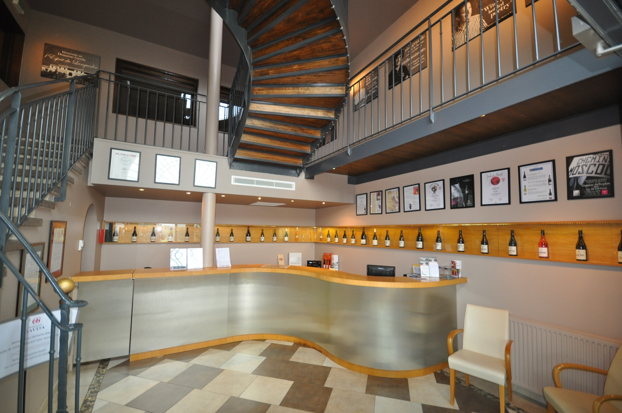


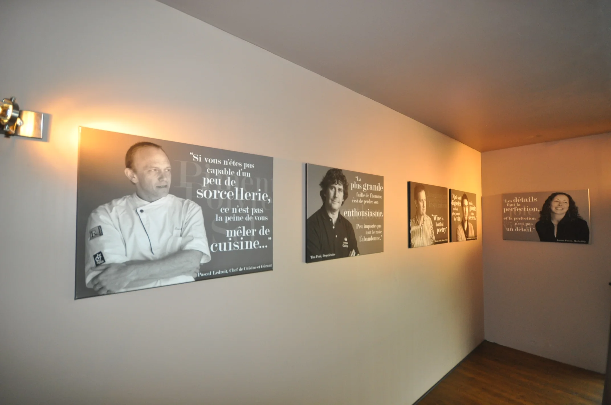
S P A C E S - W I N E R Y G A L L E R Y
Canvas design for a winery's gallery in the Languedoc-Roussillon, France.
This organic vineyard, winery, wineschool, and restaurant is located in the heart of the Languedoc region in France, 30 minutes outside of Carcassonne. They are known for their award-winning wines, exquisite modern French cuisine sourcing local and seasonal ingredients, and stunning venue location.
To introduce the team to visitors, we envisioned populating the gallery in the winery, above the tasting room, with a photo of each member and their adage. The first two of the team photos were taken by me, the others by Ollie Ford and Joanne Payan. I added in the sayings for each in an illustrative fashion, had them printed, and then hung in the domaine's chic, modern style.
It was such a success that we continue to add to the gallery. Guests are continually commenting on the beautiful canvasses and how lovely it is to see the team and get a glimpse of each personality.
Product Design
Product Design


P R O D U C T D E S I G N - P A I N T E D L A B E L S
New label design for a Pacific NW winery.
This winery values quality, accessibility, and representing the NW wine culture. To demonstrate the uniqueness of each of their wines, NW Cellars wanted labels that were easy to identify, different, and simply descriptive of what was in each bottle.
These labels are a study in the juxtaposition of bold vs subtle: the big, bright monogram instantly identifies the varietal while establishing unity across the series, and the intricacies of the hand painted design gently describe the wine with changes in texture (rough, smooth, dry) and color (differing tones denoting the range of fruit flavors on the palate). NW Cellars now has a unique, unified label series that is appealing to both the new and discerning wine buyer.
Outdoor Advertising
Outdoor Advertising


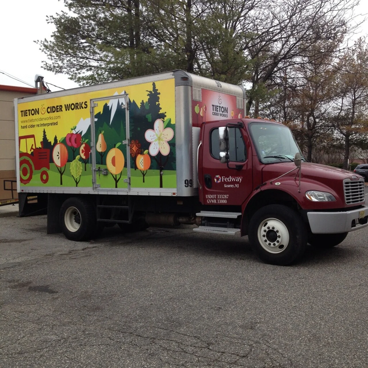
O U T D O O R A D V E R T I S I N G - B I G I M P A C T
Semi truck design for a Pacific NW Cidery.
Tieton Cider Works is an enviable anomaly in the cider industry - family owned for three generations, all their heirloom cider apples are estate grown. As Washington's largest craft cider grower and producer, they are poised to become a category leader across the US.
While appealing to this large audience, Tieton Cider Works wanted to emphasize the importance of the estate grown concept while having fun with a recognizable truck for deliveries around cities. Designing the entire outside of the truck, I used the fruit trees from the already designed labels and took them out of that environment and into where they belong - the orchard. This is balanced with an aerial photo of the orchard (which is the inspiration behind their spiral logo) to show a brand that is rooted in good grounding and also just fun to drink.
The design was so well received that additional trucks have been commissioned.
Educational Materials
Educational Materials

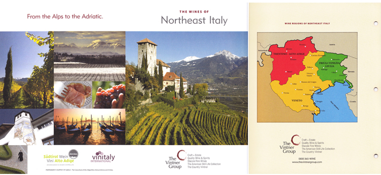


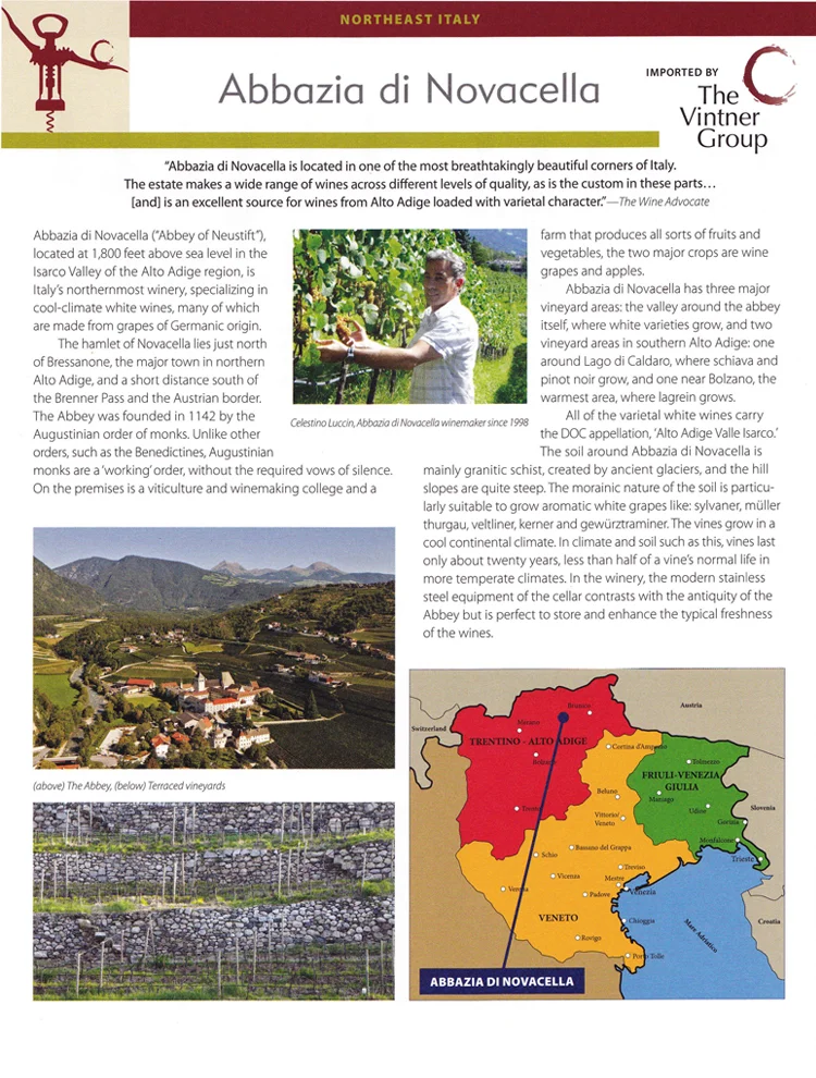
E D U C A T I O N A L M A T E R I A L S - A P P E L L A T I O N O V E R V I E W
A National wine importer and distributor needed to educate their customers on a unique appellation in Italy.
Country Vintner, a division of the Winebow Group, needed to add to their educational materials in order to highlight some of the stellar wines that come out of this small Italian region. Working with a design and printing company, I researched NW Italy extensively. Reaching out to suppliers for illustrative photos and product information, and trade organizations for regional facts, I wrote all copy and designed the layout of this tri-fold folder with inserts.
The sales team was very happy to be equipped with such a colorful - literally and figuratively - educational piece as a leave behind for their customers.